
Pop Wall Art
Premium matte canvas, made to order and delivered ready to hang.
- High Quality Prints
- Easy to Hang
- Durable

Vibrant Pop Art Portrait Wall Art & Canvas Print
$141.23
Retro Pop Collage Portrait Wall Art & Canvas Print
$141.23
Citrus Pop Art Kitchen Composition Wall Art & Canvas Print
$141.23
Man of Steel Superman Pop Art Movie Poster Wall Art & Canvas Print
$141.23
Pop Graffiti Music Icon Wall Art & Canvas Print
$141.23
Hip Hop Pop Portrait Wall Art & Canvas Print
$141.23
Retro Desert Flower Motel Pop-Art Wall Art & Canvas Print
$141.23
Surreal Pop-Art Motel Night Scene Wall Art & Canvas Print
$141.23
NYC Pop Graffiti Collage Statement Wall Art & Canvas Print
$141.23
Pop Surreal NYC Luxury Scene Wall Art & Canvas Print
$141.23
Retro Pop Typography Statement Wall Art & Canvas Print
$141.23
Modern Pop Peacock Profile Wall Art & Canvas Print
$141.23
Vibrant Pop Art Peacock Statement Wall Art & Canvas Print
$141.23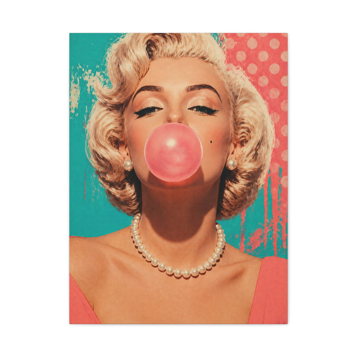
Retro Pop Glam Bubble Portrait Wall Art & Canvas Print
$141.23
Luxury Street Pop Billionaire Rebel Street Wall Art & Canvas Print
$141.23What Makes Pop Wall Art Work?
A strong pop image is built on restraint that does not look like restraint: two or three flat colours, one clear subject, hard edges, and a background that asks for nothing. A weak one hedges. It uses six colours because it can, softens the edges with gradients, and lays halftone texture over the whole surface instead of where the texture earns its place. From across a room the strong one is a shape and the weak one is a smudge.
Edge quality is the quickest test. Zoom in on a candidate and look at where two colours meet. Clean, deliberate boundaries mean the image was designed flat and will print flat. Fuzzy, feathered edges usually mean a photograph was pushed through a filter, and enlargement makes that obvious in a way a phone screen hides.
Colour then decides where it can hang. Pop palettes are saturated and they do not negotiate, so the wall behind should be plain and the surrounding room should not be competing. White, off-white and mid-grey all work. A wall that is already a strong colour will either clash or swallow the piece, and patterned wallpaper behind pop art is a fight nobody wins.
Text is where these often fail. Speech bubbles and single words look fine on a screen and can turn shouty at size, particularly in a room you sit in every evening. Wordless pop ages better in living spaces; the lettered kind belongs in a hallway, a games room or a home bar, where you see it in passing and it never gets the chance to wear thin.
One placement tip that costs nothing. Hang these in pairs or a tight grid with equal, generous gaps, and keep the gaps consistent to the millimetre if you can. The style is graphic, so the eye reads the spacing as part of the design — and an uneven pair looks far worse here than it ever would with landscapes.