
Fashion Brand Wall Art
Premium matte canvas, made to order and delivered ready to hang.
- High Quality Prints
- Easy to Hang
- Durable

Neon Shadow Fashion Portrait Wall Art & Canvas Print
$141.23
Editorial Fashion Color Shadow Portrait Wall Art & Canvas Print
$141.23
High Fashion Editorial Neon Shadow Portrait Wall Art & Canvas Print
$141.23
Futuristic Cyberpunk Fashion Portrait Wall Art & Canvas Print
$141.23
Luminous Fashion Portrait Contemporary Wall Art & Canvas Print
$141.23
Dalmatian Fashion Editorial Portrait Wall Art & Canvas Print
$141.23
Urban Neon Street Gang Fashion Portrait Wall Art & Canvas Print
$141.23
High-Fashion Satin Portrait Wall Art & Canvas Print
$141.23
Geometric Fashion Portrait Elegance Wall Art & Canvas Print
$141.23
Expressive Fashion Collage Portrait Wall Art & Canvas Print
$141.23
Fashion-Forward Feminine Floral Wall Art & Canvas Print
$141.23
High-Fashion Sunglasses Portrait Wall Art & Canvas Print
$141.23
Old Fashioned Gentleman’s Club Poster Wall Art & Canvas Print
$141.23
Urban Fashion Graffiti Portrait Street Wall Art & Canvas Print
$141.23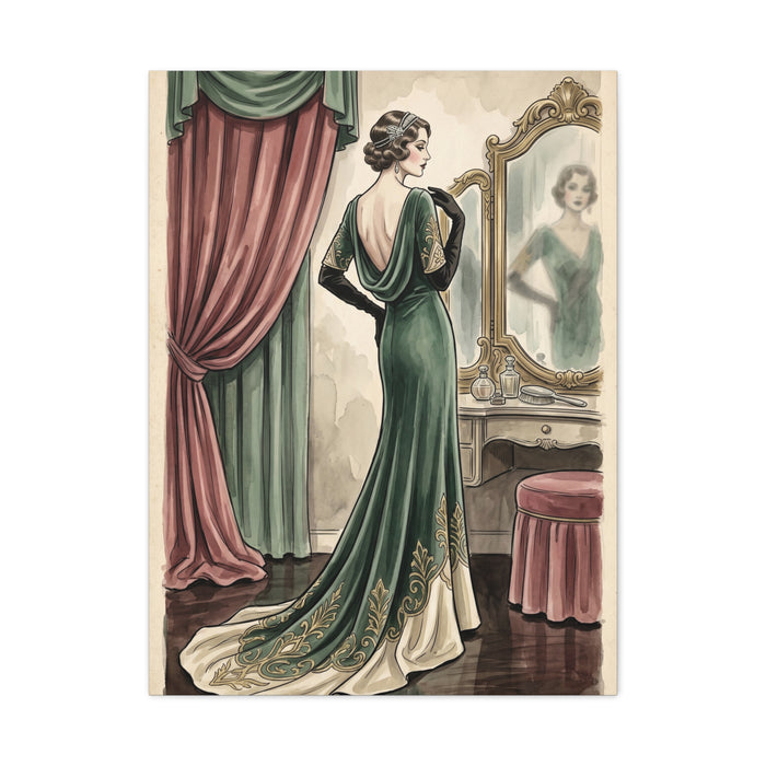
Vintage Fashion Atelier Illustration Wall Art & Canvas Print
$141.23Fashion Typography Wall Art
Typography-led fashion art changes character with the light more than almost any other subject, because it is mostly flat field and edge. A wall of black lettering on white sits crisp and graphic in morning light; by late afternoon, with warm low sun raking across it, the white reads cream and the whole thing softens. Nothing has changed but the room. If you like the piece for its snap, you need to know when the room delivers snap and when it does not.
North-facing rooms and consistent artificial light suit this work best, since even, cool light keeps whites white and edges hard. Rooms with strong directional sun get a second problem: glare across a large flat pale area is far more noticeable than glare across a busy image, because there is nothing to distract from it. Hang it on the wall the sun comes from rather than the wall the sun lands on, and the issue mostly disappears.
Scale behaves differently here too. Word art needs enough size for the letterforms to feel deliberate rather than decorative, but it does not need to dominate; the white space around the words is doing half the work. Cropping matters more than in pictorial art — a design with generous margins looks composed, and the same design cropped tight to the letters looks like a screenshot.
Good examples in this genre are quietly confident about restraint: one or two colours, one typeface doing the talking, no drop shadows or gold effects layered on to signal luxury. Weak ones pile on gloss, glitter textures and three competing scripts, which reads cheaper the closer you get. Look at the small text and the spacing between letters; that is where care or carelessness shows.
Practical tip: photograph the wall at the time of day you most use the room, then hold the artwork image beside it on your screen. If the black in the picture looks darker than any shadow on your wall, it will read as a hard rectangle rather than part of the room, and you may want something with a softer background.