
Blue & Gold Wall Art
Premium matte canvas, made to order and delivered ready to hang.
- High Quality Prints
- Easy to Hang
- Durable

Vertical Gold and Blue Abstract Wall Art & Canvas Prints
$141.23
Blue and Gold Flow Abstract Wall Art & Canvas Prints
$141.23
Gold and Blue Motion Sweep Abstract Wall Art & Canvas Prints
$141.23
Blue and Gold Abstract Motion Wall Art & Canvas Prints
$141.23
Gold and Blue Motion Abstract Wall Art & Canvas Prints
$141.23
Blue and Gold Stone Flow Abstract Wall Art & Canvas Prints
$141.23
Blue and Gold Radiating Abstract Wall Art & Canvas Prints
$141.23
Deep Blue Starburst Abstract Wall Art & Canvas Prints
$141.23
Radiating Blue and Gold Abstract Wall Art & Canvas Prints
$141.23
Blue & Gold Macaw Duo Wall Art & Canvas Prints
$141.23
Blue Macaw with Vibrant Feathers Wall Art & Canvas Prints
$141.23
Blue and Gold Macaw Portrait Wall Art & Canvas Prints
$141.23
Sunken Royal Treasure Relics in Deep Blue Water Wall Art & Canvas Prints
$141.23
Winter Farmhouse Blue Hour Wall Art & Canvas Print
$141.23
Grand Clubhouse Blue Hour Golf Wall Art & Canvas Print
$141.23
Blue Peony Bloom Elegance Wall Art & Canvas Print
$141.23
Blue and Gold Abstract Face Collage Wall Art & Canvas Print
$141.23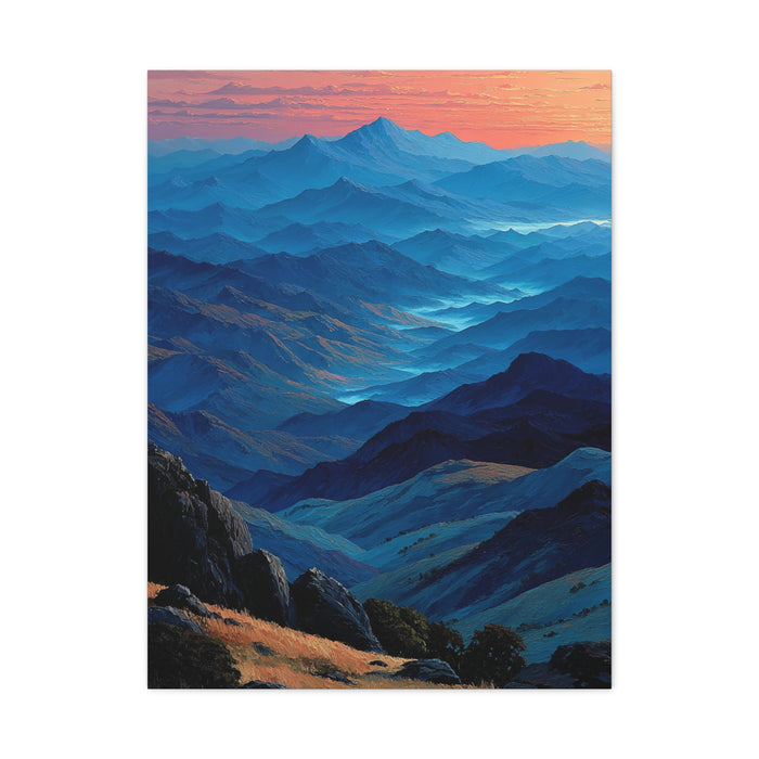
Blue Ridge Dawn Mountain Layers Wall Art & Canvas Print
$141.23
Blue-and-Gold Rain Abstract Wall Art & Canvas Print
$141.23
Elegant Blue Botanical Peacock Wall Art & Canvas Print
$141.23
Refined Blue Porcelain Peacock Wall Art & Canvas Print
$141.23
Blue Floral Hamsa Sacred Symbol Wall Art & Canvas Print
$141.23Blue and Gold Wall Art
Blue and gold work is almost always seen from across a room rather than from arm's length, and that should shape what you buy. At three or four metres, fine gold detailing merges into a general warm shimmer and deep blues flatten towards navy, so a piece that looks intricate on your phone can read as a vague dark rectangle on the wall. Favour compositions with large, confident areas of each colour and a structure that survives distance; save the delicate stuff for hallways and above desks, where people actually stand close.
The pairing itself is doing something specific: blue recedes and gold advances. That push and pull is why the combination feels rich rather than merely decorative, and it works best when the ratio is uneven — mostly blue with gold as the accent, or the reverse. Half-and-half pieces tend to fight themselves.
Light matters more for gold than for almost any other colour on canvas. Printed gold is a warm ochre-yellow rather than metallic foil, and it comes alive under warm evening lamps while looking quieter in flat daylight. If your room is lit mainly by cool white bulbs, the gold will lean mustard; swap to warmer bulbs before you blame the artwork.
For pairing, navy with gold suits traditional and classic rooms, while brighter cobalt or teal-leaning blues with gold feel contemporary. Walnut and darker woods flatter the palette; very orange oak can compete with the gold. Against a white wall the piece will pop; against a navy wall you get a moodier, tone-on-tone effect that hides the blue and stages the gold.
Try this before deciding: view the product image from the far side of the room at roughly its real size, even if that means stepping well back from your screen. Whatever structure survives that distance is what you will actually live with.